We have so many new things here! The Knowledge Base has been updated, the first work reports, project folders and much more have appeared - in general, the digest turned out to be rich. To keep abreast of new features, read Weeek Week #57.
In the new Weeek Week, we have a lot of updates for you - they are mainly in the web version, but a few updates have also been added to the Android version. Can't wait to brag and share everything - let's watch.
Web version
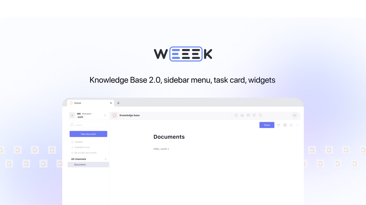
Knowledge Base 2.0
Let's start with big changes. The first in line is the updated Knowledge Base, which we have all been waiting for. Let's see what's new.
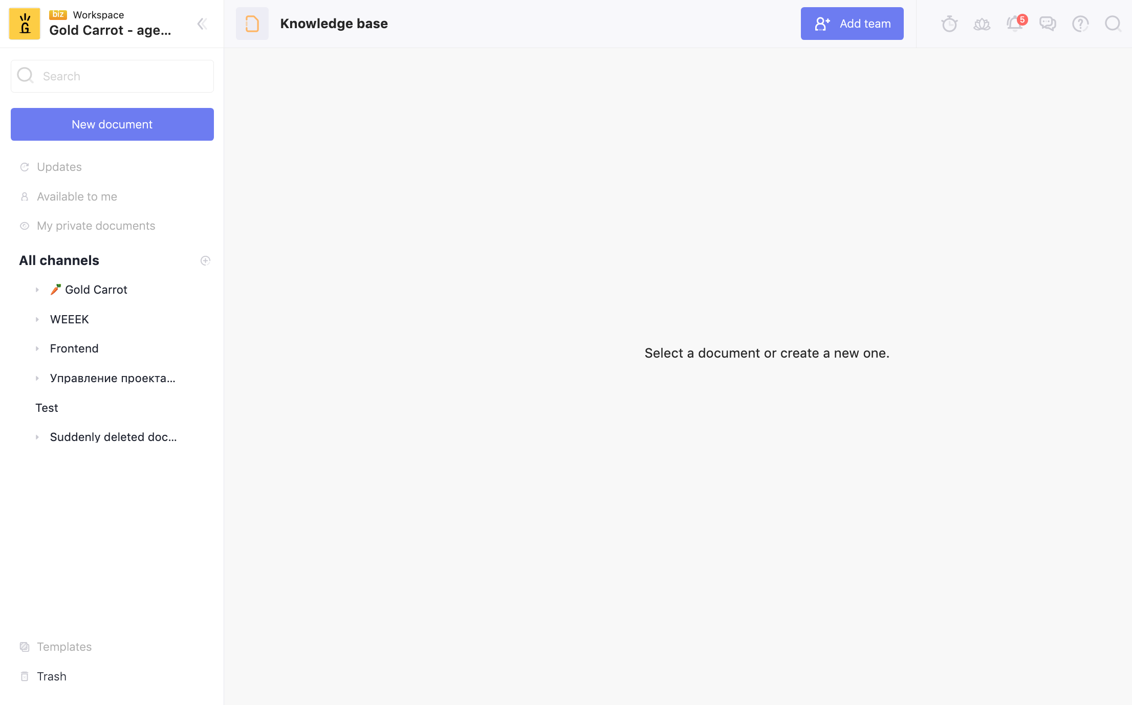
- Improved interface design.
The design of the sidebar menu has changed - it has been made more minimalistic and some of the icons have been removed. And in the main part of the page - if a document is not selected, a corresponding inscription appears.
- Basket.
At the bottom, in the sidebar menu, there is a trash, where deleted documents are stored. Suddenly you delete something wrong - go to the trash and click on the icon to the right of the document.

- New text editor.
But the most important updates are inside. We completely changed the functionality of the editor and added a bunch of features:

There are 3 icons in the top right corner:
- "Favorites" to mark important documents. If you click on the button, the file will be highlighted in the side menu and stored at the top.
- "Print".
- "Copy" (but not yet available).

There was a hot key "/" to bring up the menu and edit the text: add a title, table, bulleted list, code and much more. Or you can call the menu on the right with the "More" button. (screencast above)

The text editor has also changed - the design of the toolbox has been improved, but the functionality remains the same. To make the text bolder, add italics, and more - select with the cursor and a window will appear.
Sidebar menu
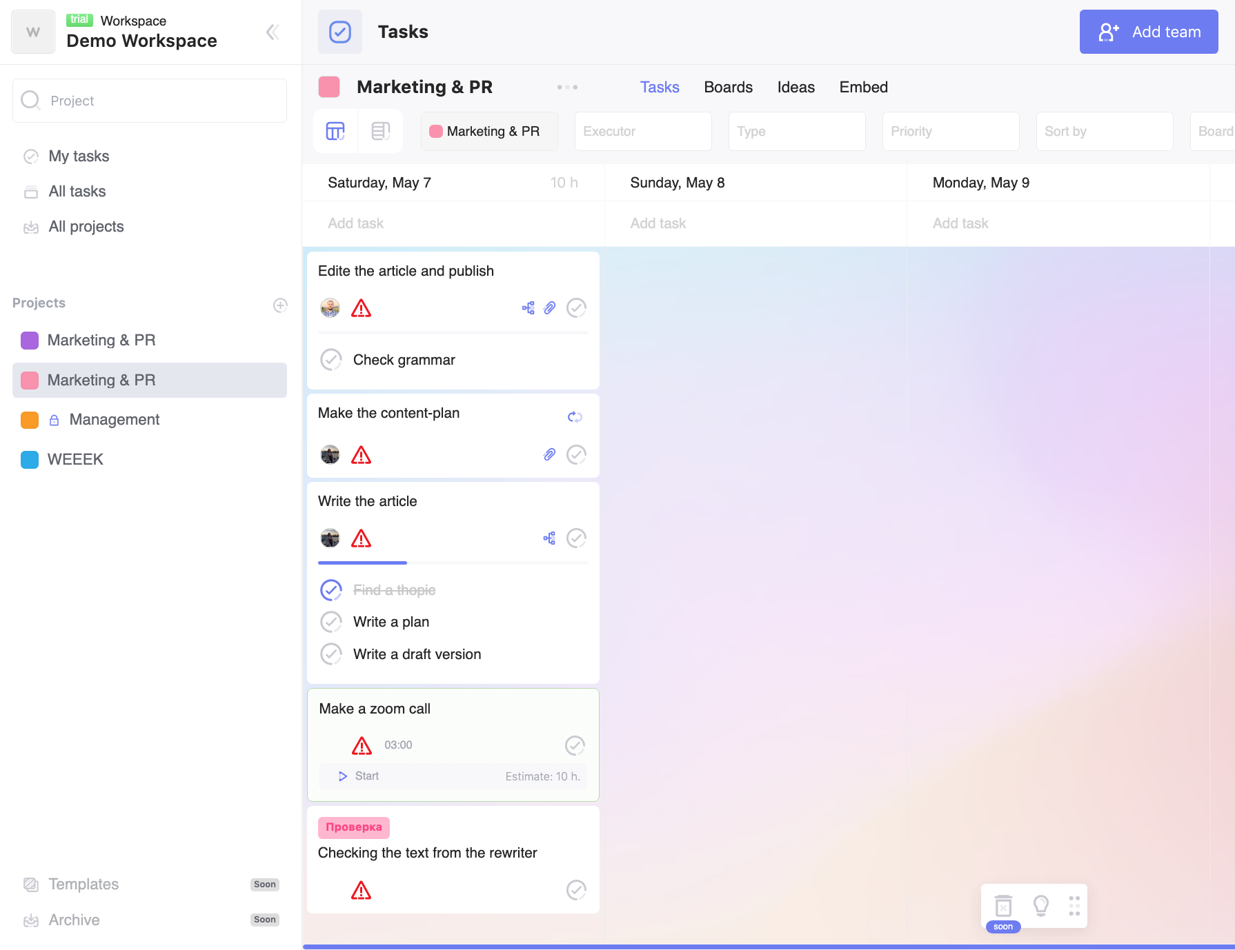
In addition to the Knowledge Base, a new menu is now in the task manager and Settings - a different design and folders have appeared. If you have a bunch of projects, just scatter them in folders - it's easier to find the one you need and nothing distracts you.
Task card redesign
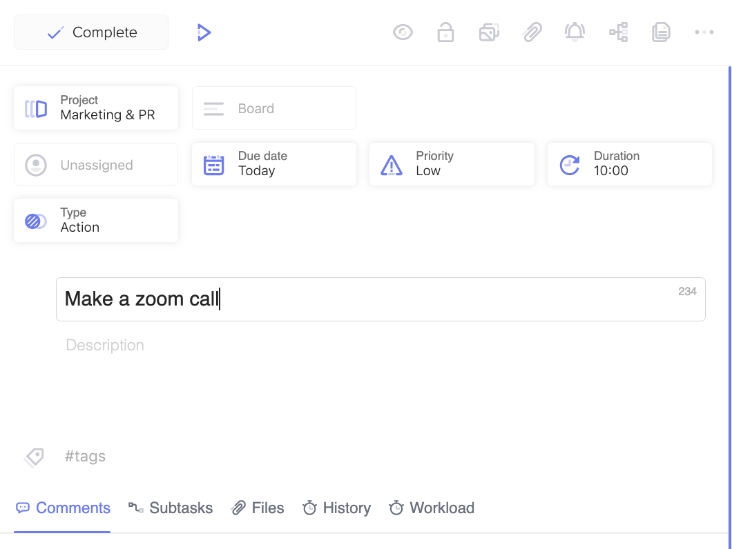
Working with tasks has become more convenient - 5 buttons have appeared at the bottom:
- Comments to discuss tasks with colleagues, attach links, etc.
- Subtasks.
- Files where documents uploaded to the task are stored.
- History - who created the task and when, etc.
- Workload. Now you can manually record the time spent on a task.
Files
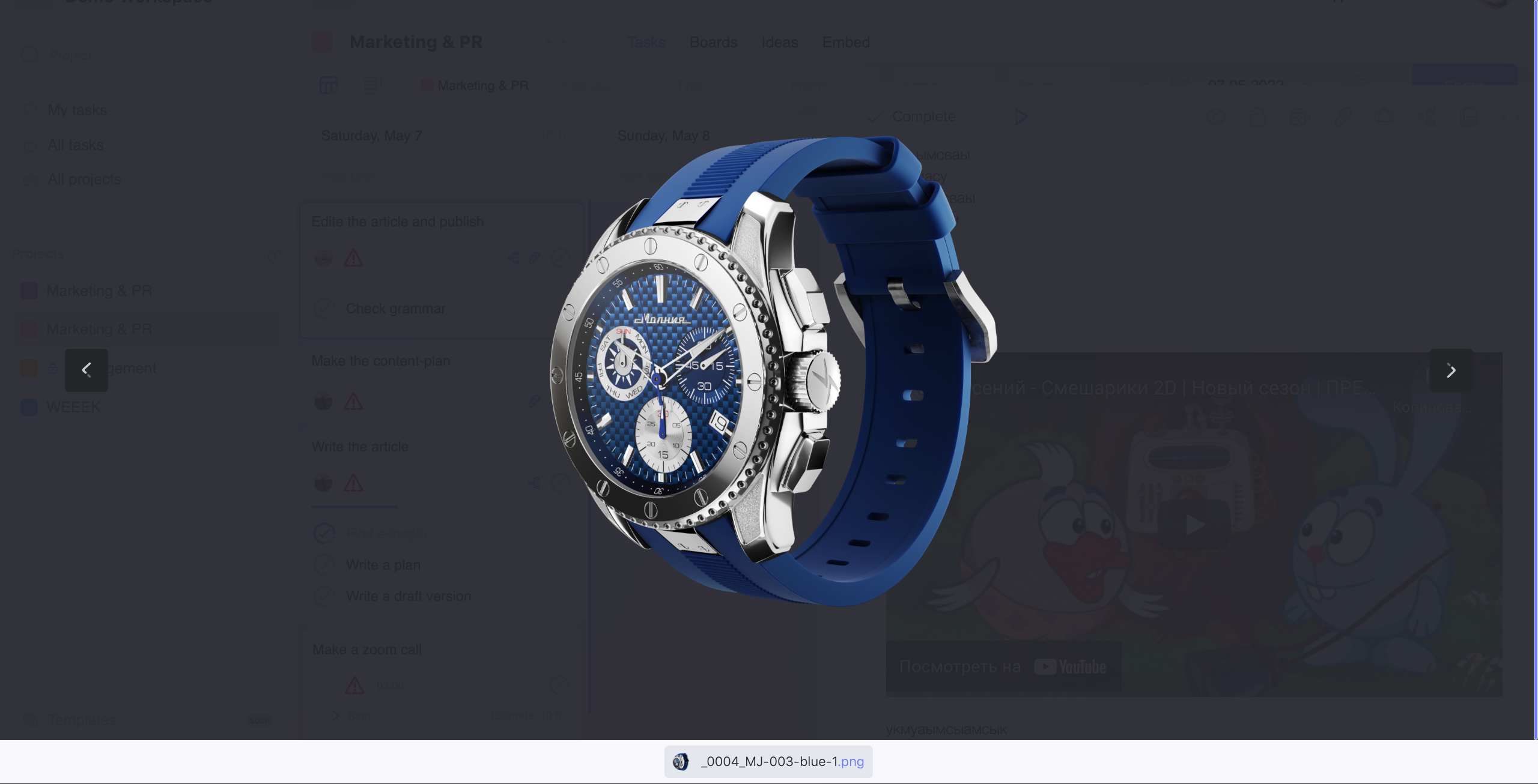
Now the files are opened in large format and in the center, and not on the left (which was not very convenient). In addition, the files in the upper left corner now have the author and download time.
By the way, the files are now not only in the task manager, but also in CRM - in the transaction card - it is more convenient to back up the details of the client, invoices, and so on.
Let's move on to small, but also important innovations:
- Board filter.
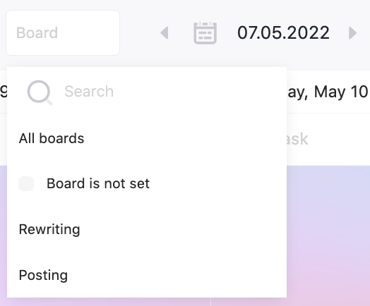
Go to the project and select the board you need in the filter - it's easier to navigate in a bunch of boards.
- Removed mandatory relocation of overdue tasks. If you do not want tasks to be carried over to the next day, go to Settings -> Appearance and uncheck the corresponding item.
- Dark theme has appeared in CRM.
Now let's go through the fixes:
- Removed a bug with subtasks - they sometimes disappeared on the task page and when opening the task via a link.
- Links in the comments to tasks sometimes did not work - we fixed it.
- Removed a bug with the disappearance of tasks when opening the list.
- Fixed a problem with avatars in CRM.
- Fixed opening tasks in Incognito - now you don't have to clear your browser history. 😎
- Task blocking is now stable.
- Improved the filter by users - removed the bug that occurred when the performer was not selected.
Android
Widgets
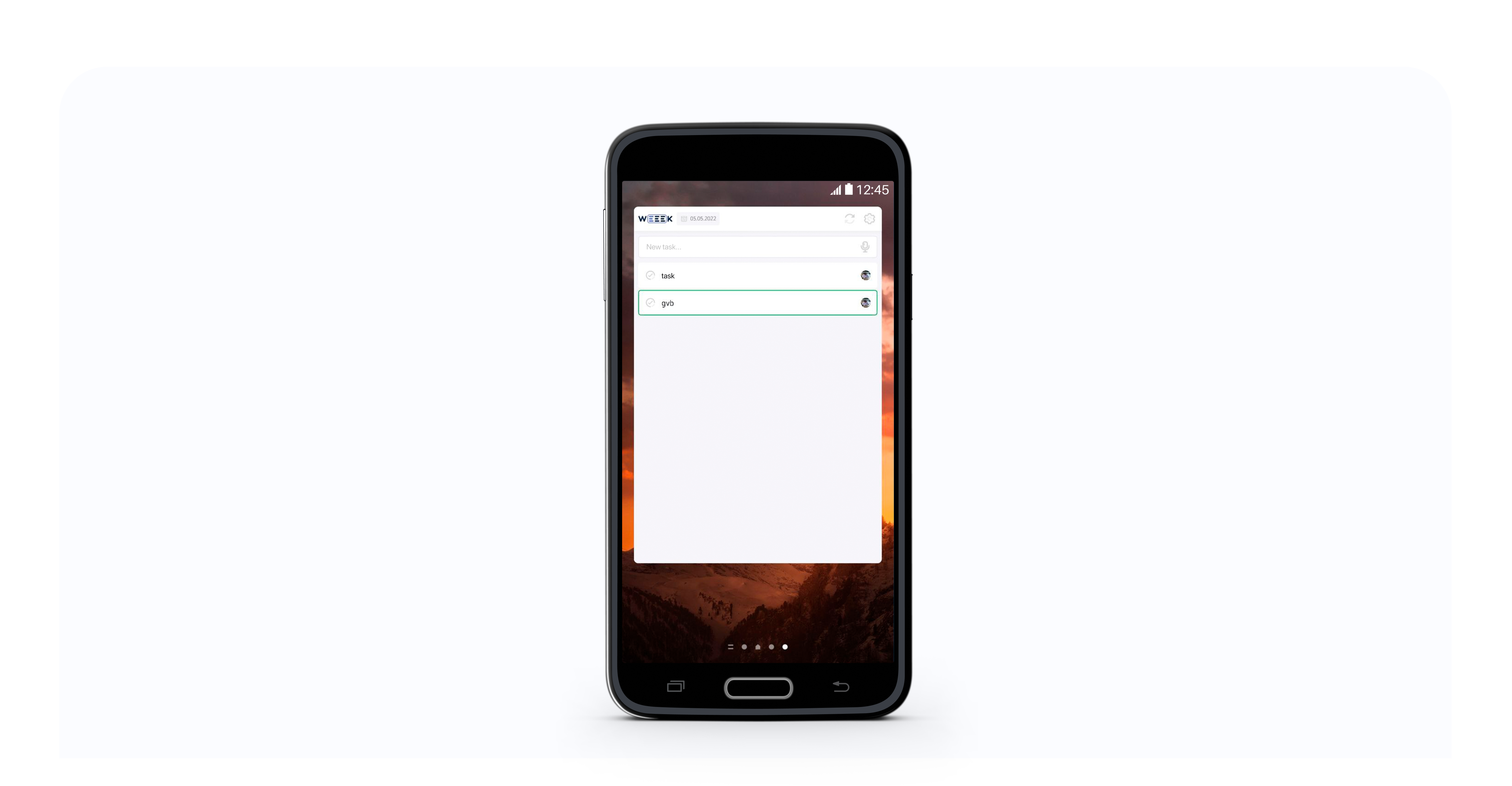
Widgets have arrived! Now you do not need to enter the application to set a task or edit it - install the widget on the main screen of your smartphone and work directly in the workspace.
You can also now create multiple widgets and set your own preferences. In addition, we have added a dark theme to widgets.
That's all - I hope you enjoy the new features! Be sure to try the Knowledge Base, and if you have any questions, write to us by mail.


