Web
Let's start with the thing that we’ve redid the "Settings" section: if earlier there were very few settings and everything fit on a screen ("Notification settings" were always separate), now the settings are divided into three tabs:
- Profile
-
Security
- Display
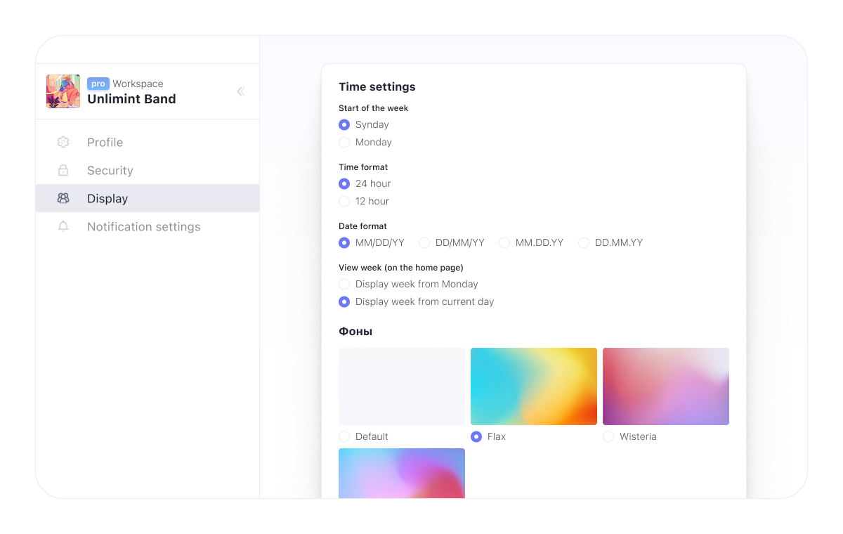
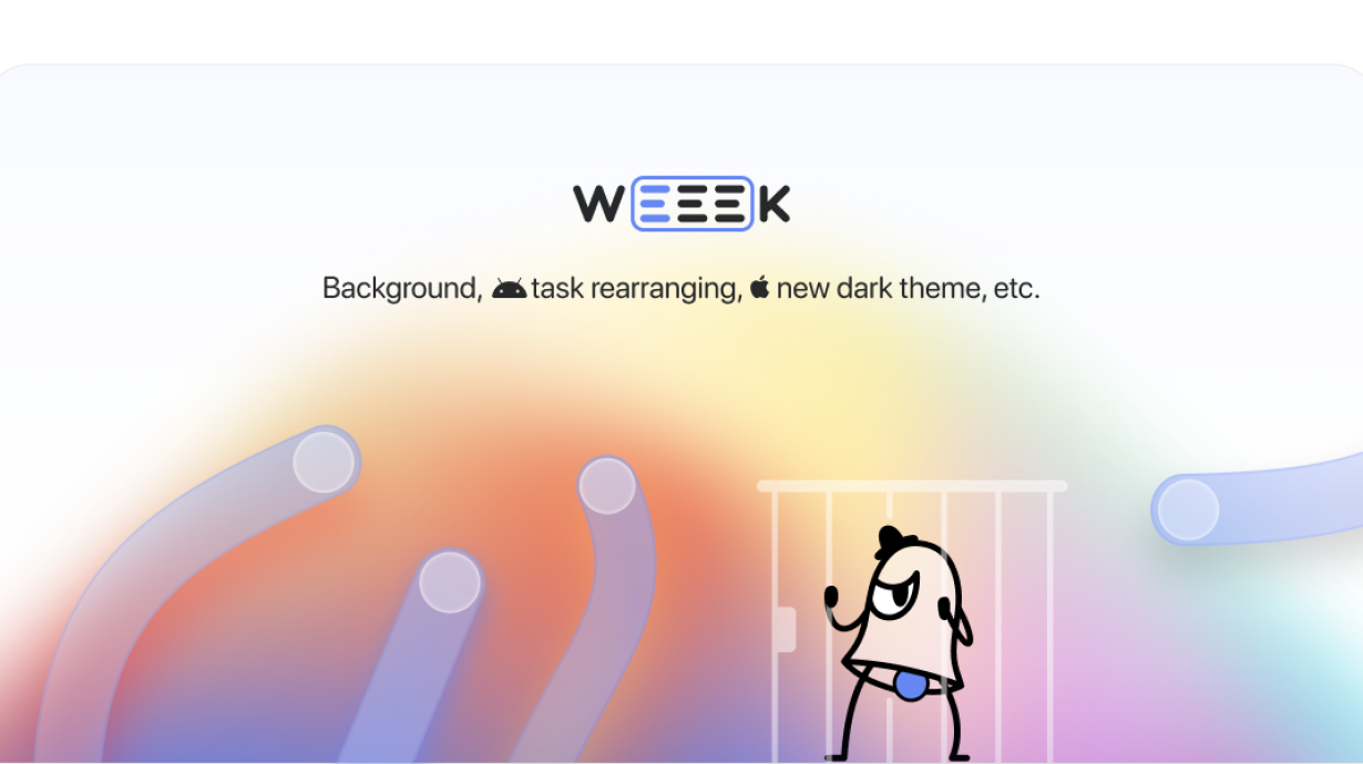
This has finally happened: we added the background setting to the web version of Weeek, especially for those who are tired of white (or gray in a dark theme) color. For now, you can choose from several cool gradients, but in the near future you will be able to choose colors and upload your own images. This and a couple of other settings are available on the Display tab.
Android
Meanwhile, Weeek on Android smartphones has become more convenient and now requires less action.
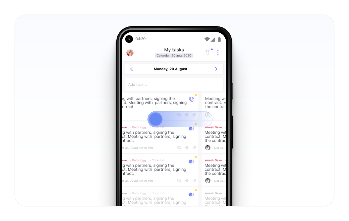
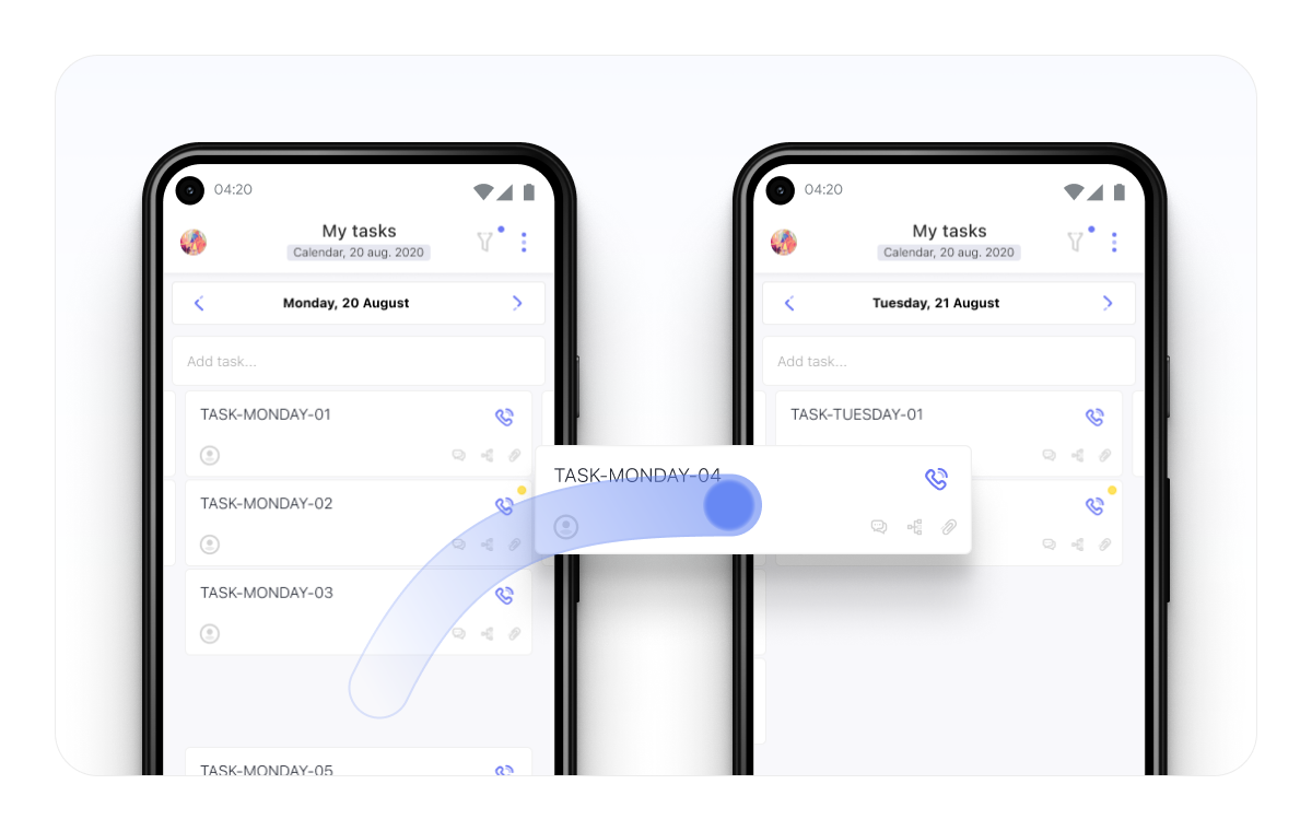
First, the days in the calendar mode can be flipped left and right. Plans for today or any other day from now on are just a swipe away. Second, tasks can be dragged between days. There is no need to go inside and change the deadline.
iOS
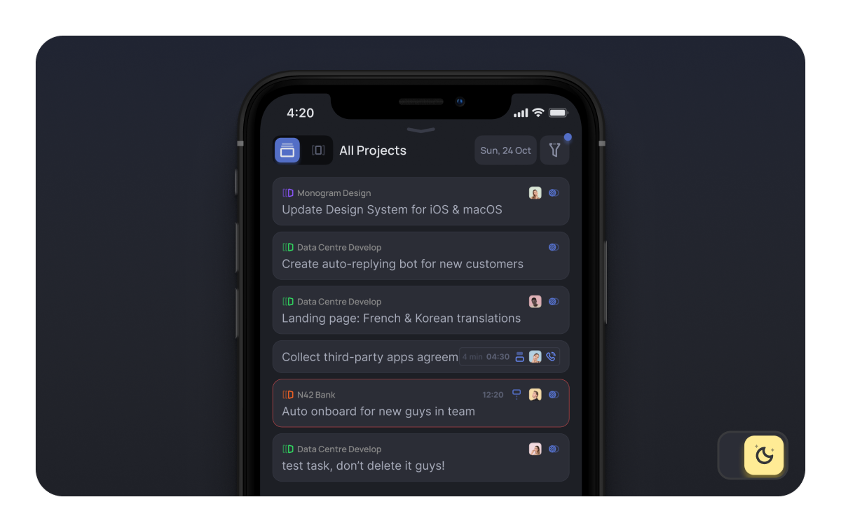
We've updated the dark theme on iOS. Now it's:
- contrast to enjoy without straining your eyes;
- light enough to use during the day;
- dark enough to use at night.
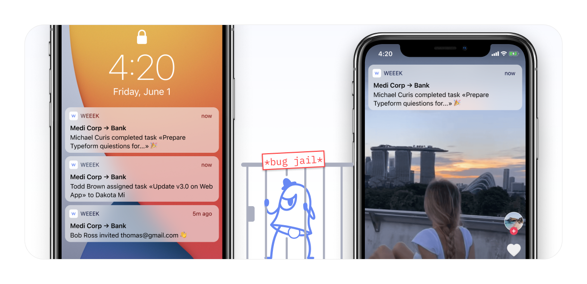
We have fixed the notification system. We honestly admit that since the launch of notifications in Weeek for iOS, there have always been problems with them as they did not appear regularly. Now everything is fine and you will not miss anything important.
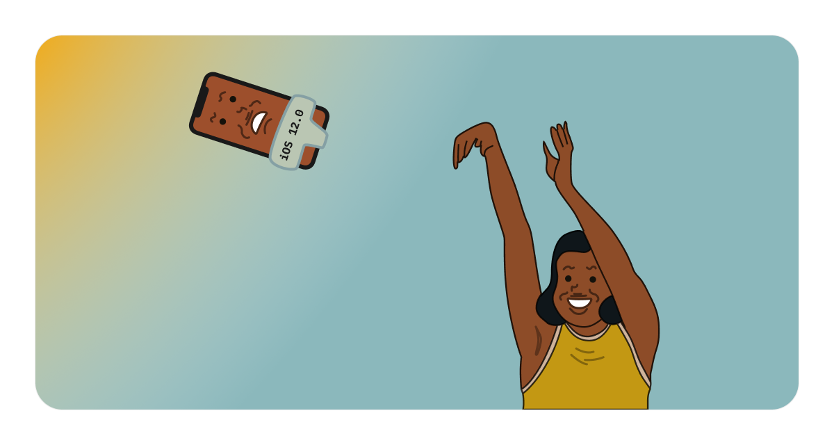
iOS systems 12 and older are no longer supported. You can use the old version, but there will be no more updates. If you delete the app, the latest version is available on iOS 12 and can be restored via the App Store.
Go change the background in the web version and update the apps on iOS and Android, while we are finishing the new big update. Write about your impression of Weeek, problems, comments and suggestions in our telegram chat.


