What Is a PERT Diagram?
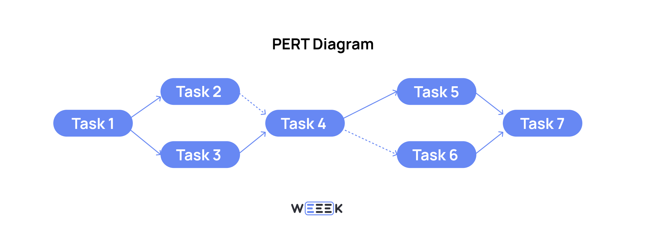
📌 A PERT diagram (Program Evaluation Review Technique) is a project management tool used to visually plan and organize tasks while showing their interdependencies.
Here’s what the diagram typically displays:
- Project tasks. Key milestones that mark the start of a new phase after completing the previous set of tasks.
- Timelines. Some versions show multiple timelines, including optimistic, pessimistic, realistic estimates, and the final deadline.
- Project resources. Primarily the time required to complete tasks.
- Dependencies between tasks. The relationships between tasks and the order in which project stages should be carried out.
How a PERT Diagram Works
The PERT diagram is used to coordinate both connected and independent stages of a project. How does it work?
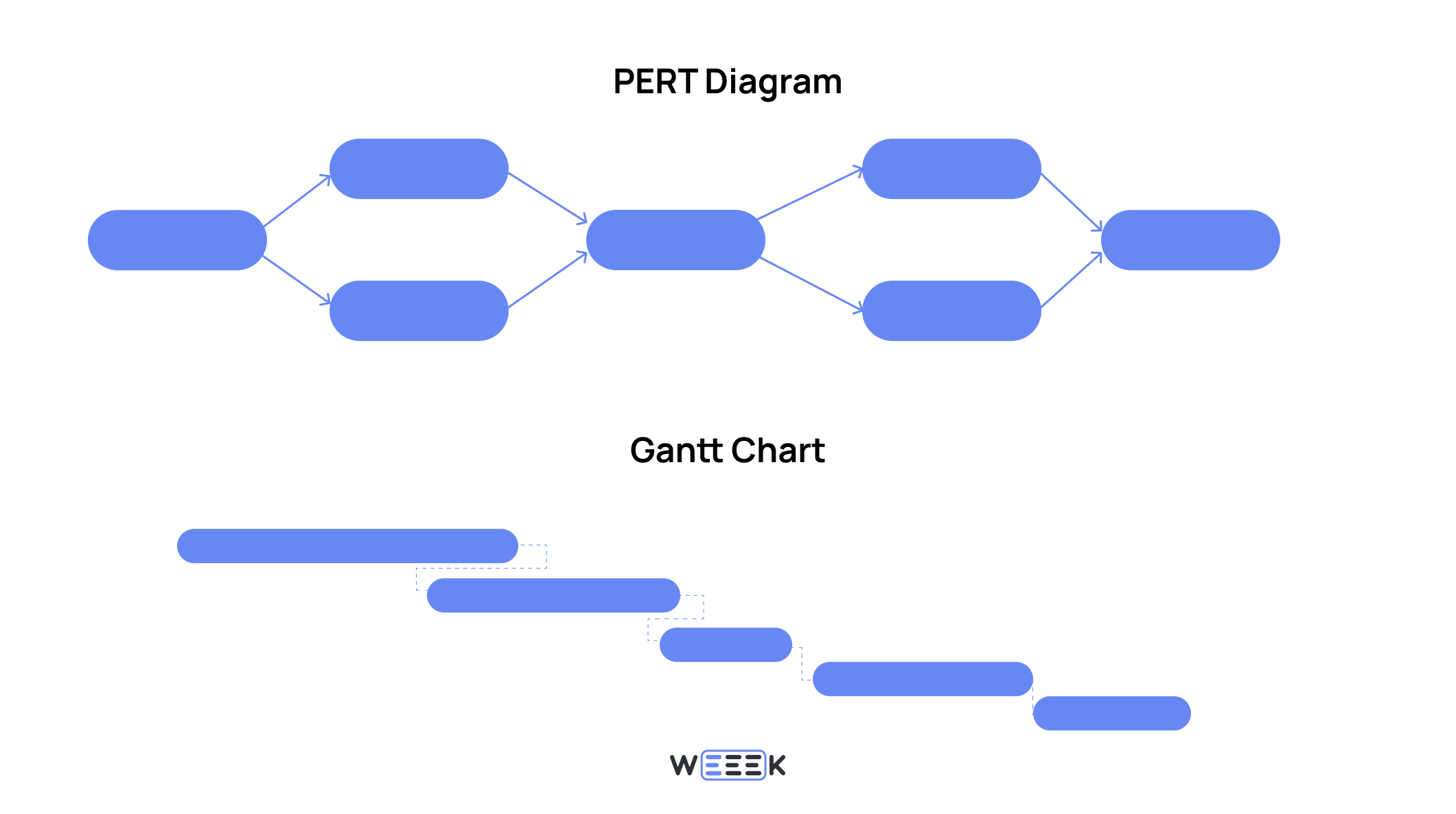
In function, PERT is similar to a Gantt chart. Both are used to organize project stages and manage their dependencies. However, a PERT diagram is simpler to create and easier to interpret.
A PERT diagram is particularly useful at the start of a project when high-level plans need to be outlined and communicated to stakeholders quickly.
With a PERT diagram, you can:
- Align the schedule and sequence of key project stages and present them to management
- Visualize a complex project in a single diagram
- Estimate the time needed for various tasks and stages
- Calculate the total time required to complete all related stages
How a PERT Diagram Differs from a Gantt Chart
The PERT diagram often gets compared to the Gantt chart, another tool that organizes project tasks into stages, tracks deadlines, and links tasks through dependencies. So, what’s the difference?
A PERT diagram:
- Highlights key milestones without diving into details
- Is easy to construct
- Is straightforward to read
- Fits all critical milestones — from the project’s start to finish — on a single page
- Uses a network diagram format
PERT is perfect for high-level project planning and presentations to external stakeholders. It shows how and when a project can be completed, focusing on the overall timeline rather than the finer details.
Gantt Chart:
- Is more detailed and comprehensive — it shows the relationships and dependencies between tasks, not just the sequence
- Is slightly more complex to build than a PERT diagram, but still easy to read
-
Fits all key milestones — from the start to the completion of the project — on a single page
- Appears as a bar chart
The Gantt chart is perfect for internal use during project execution. Its level of detail is exactly what a team needs to move systematically through the project’s roadmap.
💡 A PERT diagram offers a zoomed-out view of the project plan, giving a broad overview. In contrast, a Gantt chart provides a zoomed-in view, delivering a more detailed breakdown of the project plan.
How to Build a PERT Diagram in 4 Steps
Step 1: Define the Tasks
Collect all the intermediate deliverables that will indicate the project’s overall progress. These are the specific tasks the team will work on.
It’s also helpful to classify tasks as project milestones. Ideally, phrase them as outcomes — for example, instead of “Build a website,” simply say “Website.”
What you might need:
- Project summary, charter, or business plan — documents that consolidate the key project details
- Meetings with the team to discuss upcoming tasks
- The organizational structure of the team or company
- A clear understanding of resources — financial justification included in the project summary or any document that outlines resource availability
Step 2: Set Dependencies and Links Between Tasks
Tasks should be connected based on two criteria: content and resources.
The team needs to communicate to establish what is required to complete each task. In some cases, resources (existing or additional) are necessary. In other cases, the output of one task affects the next — this is where content dependencies come into play.
For example, if the project is to build a website:
Content-dependent tasks. Create design mockup ➡️ Write website code. The code can’t be written without a design.
Resource-dependent tasks. Create design mockup ➡️ Create brand guidelines. The brand guidelines can’t be developed until the designers finish the mockup.
Tasks independent of resources. Develop website concept ➡️ Create design mockup. The business owner may create the concept but isn’t involved in the design process, so their resources aren’t needed for design. However, the design still depends on the concept.
Step 3: Set Deadlines for Events
To establish deadlines in a PERT diagram, four key parameters are commonly used:
- Optimistic time
The time needed to complete a task under the best conditions — when it’s done by highly skilled professionals who don’t face setbacks like illness, vacations, missed deadlines, or errors. Essentially, this is the "ideal" scenario.
- Pessimistic time
This accounts for everything going wrong — training delays, risks materializing, mistakes being made, and key team members leaving. This is the worst-case scenario.
- Realistic time
A more balanced estimate based on the team’s experience, often the closest to what actually happens.
- Set deadline
The actual date by which the task must be completed. It could align with any of the time estimates above.
There’s also a formula used to calculate expected time in a PERT diagram, which considers three parameters:
- Minimum time (tmin). The shortest time to complete the task — the optimistic estimate.
- Most likely time (tmost). A realistic estimate based on typical conditions.
- Maximum time (tmax). The longest time the task could take — the pessimistic estimate.
The total expected time (TE) is calculated using this formula:
💡 TE = (tmin + 4 * tmost + tmax) / 6
The reason for dividing by 6 isn’t explained, but the formula gives a reasonable average time estimate.
For example, if tmin is 2 days, tmost is 3 days, and tmax is 5 days, the formula gives:
TE = (2 + 4 * 3 + 5) / 6 = 3.33 days
It's crucial to inform the team about how time calculations will be made and agree on the units of measurement — whether using days, hours, months, or even years.
Why go to this length? The goal is to calculate the overall project timeline as accurately as possible. With this detailed approach, the estimates are likely to be very close to reality.
Step 4: Build the Diagram
Once all the data is collected and analyzed, you can start creating the diagram.
A PERT diagram looks like a flowchart or network diagram, where the blocks represent events with their deadlines. Dependencies between events are shown with arrows: content-based links use solid arrows, while resource-based links use dashed arrows.
💡 It's easier to first draw the blocks for the tasks and stages, then connect them with arrows, and finally add the deadlines. Afterward, it's a good idea to review the entire diagram — you’ll likely need to make some adjustments.
Try these five tools for creating a PERT diagram:
- Lucidchart — Offers all the necessary features for building diagrams, templates, and export options in various formats.
- EdrawMax — Supports 3D visualization, animations, and interactive elements.
- VisualParadigm Online — Easy to use and intuitive, with export options in multiple formats.
- MindOnMap — Free, with many features and templates available.
- SmartDraw — Comes with a ready-made PERT template, making it easy to customize.
When to Use a PERT Diagram
A PERT diagram is ideal for planning large, multifaceted projects that require substantial resources such as time, personnel, and expertise. It helps manage extensive information that’s hard to track mentally.
Let’s get more specific — here’s when a PERT diagram is particularly useful:
✔️ For complex and non-standard projects. These are challenging to break down into smaller, clearly defined tasks.
✔️ For large projects with multiple interdependencies. It provides a clear overview of the entire project.
✔️ For projects where time estimates and risk assessments are key. The diagram helps identify the critical path — the sequence of tasks that determines the project’s timeline and success.
✔️ For projects requiring flexibility and adaptability. The diagram is easy to adjust without disrupting the overall structure.
Examples of suitable projects:
- Software development. Especially useful for new software or digital products
- Launching a new product, not limited to IT
- Construction. Whether it’s a building, a bridge, or even a playground
- Executing a large marketing campaign
- Research projects, where teams prepare, conduct the research, and analyze the outcomes
- Event planning, such as organizing a conference or festival
Example of a PERT Diagram
You can structure a PERT diagram as a table, which is handy for using as an internal project calendar or keeping at hand to track estimates and deadlines.
For example, here’s a PERT table for a new product launch:
| Event | Event Description | Previous Event(s) | Optimistic Time | Pessimistic Time | Realistic Time |
|---|---|---|---|---|---|
| 1 | Idea and main concept | 0 | 3 days | 2 weeks | 7 days |
| 2 | Design concept | 1 | 1 week | 3 weeks | 2 weeks |
| 3 | Mockup and prototype | 1, 2 | 1 week | 4 weeks | 2 weeks |
| 4 | Production | 3 | 5 days | 10 days | 7 days |
| 5 | Testing | 4 | 30 days | 60 days | 45 days |
| 6 | Launch | 5 | 1 day | 1 day | 1 day |
Here’s what the diagram would look like in the form of a flowchart or network diagram:

The diagram is designed this way for a reason. The goal is to provide a high-level view of the entire project without getting into the details. This type of diagram is essential for gaining a general understanding of the project.
Pros and Cons of a PERT Diagram
✅ Pros
- Effective visualization. You get a clear view of the entire project, complete with realistic deadlines, and know exactly where extra resources are allocated
- Improved transparency drives motivation. A PERT diagram helps explain the project to colleagues more easily, showing when and where they’ll be collaborating and who may be delayed if someone misses a deadline
- Simplifies complexity. Breaking down a complex project into individual tasks makes it more manageable and less intimidating, allowing the team to shift focus from planning to execution
❌ Considerations
- Like any diagram, PERT reflects the plan, but it doesn’t show the actual progress of the project
- It’s not ideal for projects with more intricate task relationships
- For projects with large amounts of data, a mind map might be a better fit
- It’s unnecessary for small, straightforward projects
Summing Up
✔️ PERT diagrams are ideal for planning large, complex projects with multiple tasks and dependencies. They provide a clear, high-level overview of the project, helping to manage timelines, resources, and task relationships.
✔️ PERT is especially useful for projects where accurate time estimates and flexibility are key.
✔️ The diagram simplifies the understanding of intricate projects by breaking them down into manageable tasks.
✔️ However, PERT diagrams don’t reflect the real-time status of a project and are not suitable for projects with more intricate task relationships or small, simple projects.


